

Let’s dive into a game-changer for your business: the power of a responsive website.
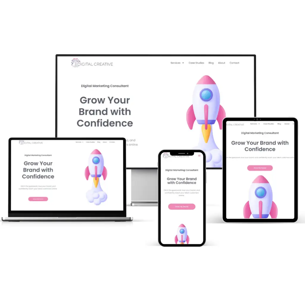
What is a Responsive Website?
A responsive website is designed to adapt and provide an optimal viewing experience across a wide range of devices. Whether your customers are browsing on a desktop, tablet, or smartphone, a responsive site ensures they have a seamless experience.
Why Should You Care About a Responsive Website?
A responsive website is more than just a perk—it’s essential! As a dynamic small to medium-sized business owner, you might wonder why this matters. Let’s uncover why a responsive website is your key to unlocking online success.
1. Increased Mobile Traffic
Did you know that over 50% of global web traffic comes from mobile devices? With a responsive website, you can cater to this wide audience and keep them engaged. By optimising your site for mobile users, you ensure that your content is accessible and visually appealing, no matter the device. This not only meets the expectations of today’s on-the-go consumers but also enhances their overall experience, encouraging them to return. Furthermore, a responsive design can improve loading times, which is crucial for mobile users who expect fast and efficient browsing.
By capturing the attention of mobile users, you open the door to increased traffic, higher engagement, and more conversions. In essence, a responsive website is key to tapping into the growing mobile market and expanding your reach.
2. Improved User Experience
A responsive design adjusts seamlessly to different screen sizes, making it easier for users to navigate and interact with your website. Happy users mean more engagement and higher conversion rates!
When visitors can effortlessly find what they’re looking for, they’re more likely to stay on your site longer, explore your offerings, and ultimately take action—whether that’s making a purchase, signing up for a newsletter, or contacting you for services. Additionally, a responsive design enhances accessibility, ensuring that all users, regardless of their device or needs, have a positive experience. This inclusivity can broaden your audience reach and foster loyalty among users.
By prioritising user experience with a responsive design, you’re not just improving engagement; you’re building lasting relationships with your customers.
3. Cost-Effective
Instead of maintaining separate versions of your site for desktop and mobile, a single responsive website can do it all.
This approach significantly cuts down on development and maintenance costs, allowing you to focus resources on enhancing your business. With just one site to manage, updates and changes become more efficient, ensuring consistency across all platforms. Additionally, a unified responsive design streamlines your branding efforts, providing a cohesive look and feel that resonates with users. It simplifies analytics and reporting too, as you only need to track one set of data, making it easier to understand user behavior and optimize accordingly. In essence, a responsive website is not only cost-effective but also empowers you to maintain a strong, consistent brand presence.
4. Better SEO
Google loves responsive websites, and for good reason. A mobile-friendly site is a crucial factor in search engine rankings, helping your business get discovered more easily online.
When your website is responsive, it ensures a seamless experience for users across all devices—something Google highly values. This means your site is more likely to appear higher in search results, increasing visibility and attracting more potential customers. Additionally, a responsive design reduces bounce rates and increases time spent on your site, signaling to search engines that your content is valuable and relevant.
In essence, a responsive website not only enhances user satisfaction but also boosts your SEO efforts, making it a win-win for your business.
Making the Switch
Embracing a responsive design might feel overwhelming, but it’s more straightforward than you imagine. Begin by partnering with a web design expert who can revamp your current site or create a new one from the ground up. Start by analysing user interactions across different devices to gain insights. Prioritise your content so that key information and features are front and centre. And remember, testing is crucial—evaluate your site’s performance on various devices to ensure a seamless user experience.
Final Thoughts
Investing in a responsive web design is not just a choice—it’s a strategic move. By ensuring your business boasts a dynamic and adaptable online presence, you’re not merely keeping pace with the competition but setting the standard. A responsive design opens doors to new opportunities, enhances user experience, and positions your brand as a leader in your industry. So, here’s to your website success and the exciting growth it will bring to your business!
Cheers to embracing the future with confidence and style!
Trish
Creative Director, Digital Creative