I recently analysed some metrics on a client’s website that showed 70% of their visitors don’t scroll down the homepage when they land on the website. On a homepage with over 1m visitors a month, that’s 700,000 visitors who do not scroll down the page after they land on the homepage. For this particular client, getting the most important information the audience is looking at “above the fold” (or on that first screen of a mobile), is critical to get the audience to entice them to continue their journey on the website (and ultimately buy something!). Showing some good old hospitality with your online customers helps them get to where they want to go quickly and most of all, ensures they enjoy their stay!
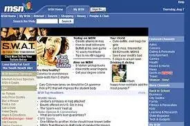
Back in the 1990s, homepages were “welcome pages”, a place where you “welcomed” people to your site. Through the 2000’s they became information hubs or shop fronts. They had everything and anything that the company did on the homepage, who they were, what they sold, what they knew and what they liked. They tried to be hospitable by being everything to everyone but they ended up being a confusing mix of cartoons, lots of text, misguided fonts and blue hyperlinks… everywhere! In some cases, you even had to click “enter site” to even get to the welcome page …eek!


Fast forward to 2022 and the humble homepage has come a long way as we have learnt more about marketing our websites online and how to be more hospitable to our online customers. The purpose of a homepage in 2022 is no longer about telling people how much you know or showcasing all of your wares, but it is your hotel lobby, a place to direct customers through their journey in order to solve their problems. A place where you have the opportunity to show a little online hospitality by making it as easy and as simple as possible to find the answers our customers are looking for.
The Hotel Lobby
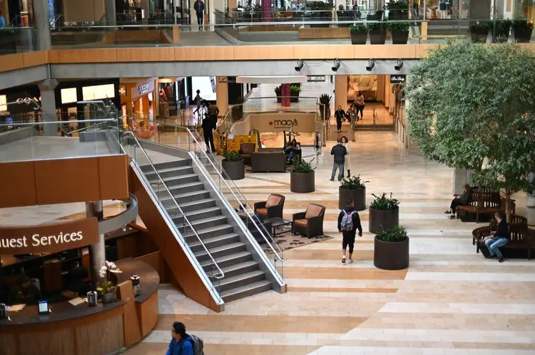
Hotel Lobbys are sleek, inviting and helpful spaces where visitors go to find a room they want, meet friends, hang out and find information for all the things they need whilst staying in that destination. Whether it be to check in and find their room or find directions to the closest greek restaurant, they offer a service to their customers by directing them to the next part of their journey.

Whilst hotel lobbies are sleek, uncluttered, spacious and roomy, your homepage (especially on mobile) has limited space so the focus needs to be on making it sleek and uncluttered. Customers need to know within seconds if they are in the right spot, where the counter is to speak to someone, where to meet their friend and how to get to their room!
That’s a lot to fit in a tiny little piece of real estate!
“Your customers should be able to tell what your business has to offer and an obvious path to buy it within 3 seconds!”
– Hubspot
So how do you decide what should be in that tiny piece of real estate?
Each page of your website needs a specific objective to help customers find what they need. The homepage’s objective is to lead customers to the parts of the site that will help them solve their problems. The homepage of my client above had the objective to get the users into the booking form which takes up the prime position on the homepage “above the fold”. As 70% of customers don’t even scroll down their homepage, that tells us that the problem they have come to this company to solve is there and ready for them on the top of the homepage “above the fold”.
By directing customers to the next stage of their customer journey, you too can offer a digital hotel lobby service that directs people to where you want them to go.
Consider some of the biggest websites in the world Google, Amazon, Netflix to name a few. When you land on their home page, it is very clear, very quickly, EXACTLY what their product is and what step they want you to take next. Google, search something. Amazon, purchase something. Netflix, watch something. The top websites in the world have a very clear objective for their homepage and they are really clear on where they want you to go next and make it easy for you to find the thing that you are looking for. They are most hospitable in helping you get to where you want to go.
But we aren’t all Google..
So how exactly do you lead your customers through your website? Hint, not all customers are there to buy something straight away, they may be browsing, wanting help, seeking answers or finding out about your business.

So how do you start leading YOUR customers through their journey on your website? Here are some industry tricks that can ensure your customers get what they need within the first few seconds of being on the homepage of your website.

1. A Catchy Headline
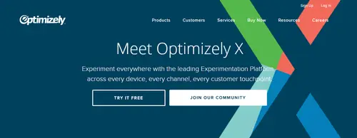
Within 3 seconds your customers should know who you are and what you offer. Keep it clear and simple with no fluff! The customer needs to know what you do.
2. A primary call to action (CTA)
what is the primary thing you want them to do on your website? Do you want them to try something? Do you want them to signup to your newsletter? Do you want them to visit your bricks and mortar store? Do you want them to make an appointment? Make it clear on the top of the homepage what the primary thing you want your customers to do next and use a primary Call to Action to direct them there. Make the action you want your customers to take obvious and make it stand out.
3. Supporting Image
Or even better, a supporting video! Using a video that clearly defines what you offer in a simple, visually appealing way goes a long way to cement your offering in your customer’s mind within the first few seconds. This needs to be a hero image, an image or video that piques their interest and gets them interested in your brand.
4. Benefits to the customer
WHY you do what you do matters and how it matters to your customers should be shown in a compelling way that speaks to your customers in their language.
5. A reason to trust you
Use creative ways to display social proof, recommendations and reviews, awards and recognition. Customers need to know they will be buying from a brand they know, like and trust.
6. Simple to Navigate
Include navigation that is simple and easy and for your customers to navigate. Most visitors to your website are not ready to buy yet, so you need ways for your customers to find out more. Links to articles, blogs and how-to’s are a great way to establish your credibility and build trust so when they are ready to buy, you are top of mind!

Your homepage directs your customers to the next step on their journey.
Hotels created lobbies as a functional hubs for their guests. To entice visitors to stay with them, provide them with the right information when they are there and direct them to the right room or the place they need to go. Website Homepages in 2022 are now the “hotel lobby “of your business’s website. No longer just the welcome page or a cluttered storefront, your homepage needs to ensure customers that are in the right place and entice them to continue their journey with you. To help your customers solve and find solutions to their problems in the most simple, compelling and inspiring way. It’s the best way of showing your customers some good old-fashioned hospitality! By piquing their interest through sleek and compelling imagery, enticing them to visit the “counter” through carefully selected CTA’s and guiding them on their journey, you can ensure your customers make the most out of their stay.
If your customers can’t see where to go next in the first few seconds of landing on your site, they will hit the dreaded back button. Show a little online hospitality and give them a reason to stay on your website by making it easy for the customers to get to where they need to go, fast!
If you need help with a little online hospitality on your homepage, contact me to find out how to turn your homepage into a place your customers want to stay.
Trish
Share via:

